WVA Portal Redesign Project
World Vision Australia Portal Redesign
World Vision Australia (WVA) is a charity organisation working with children, families and communities to overcome poverty and injustice.
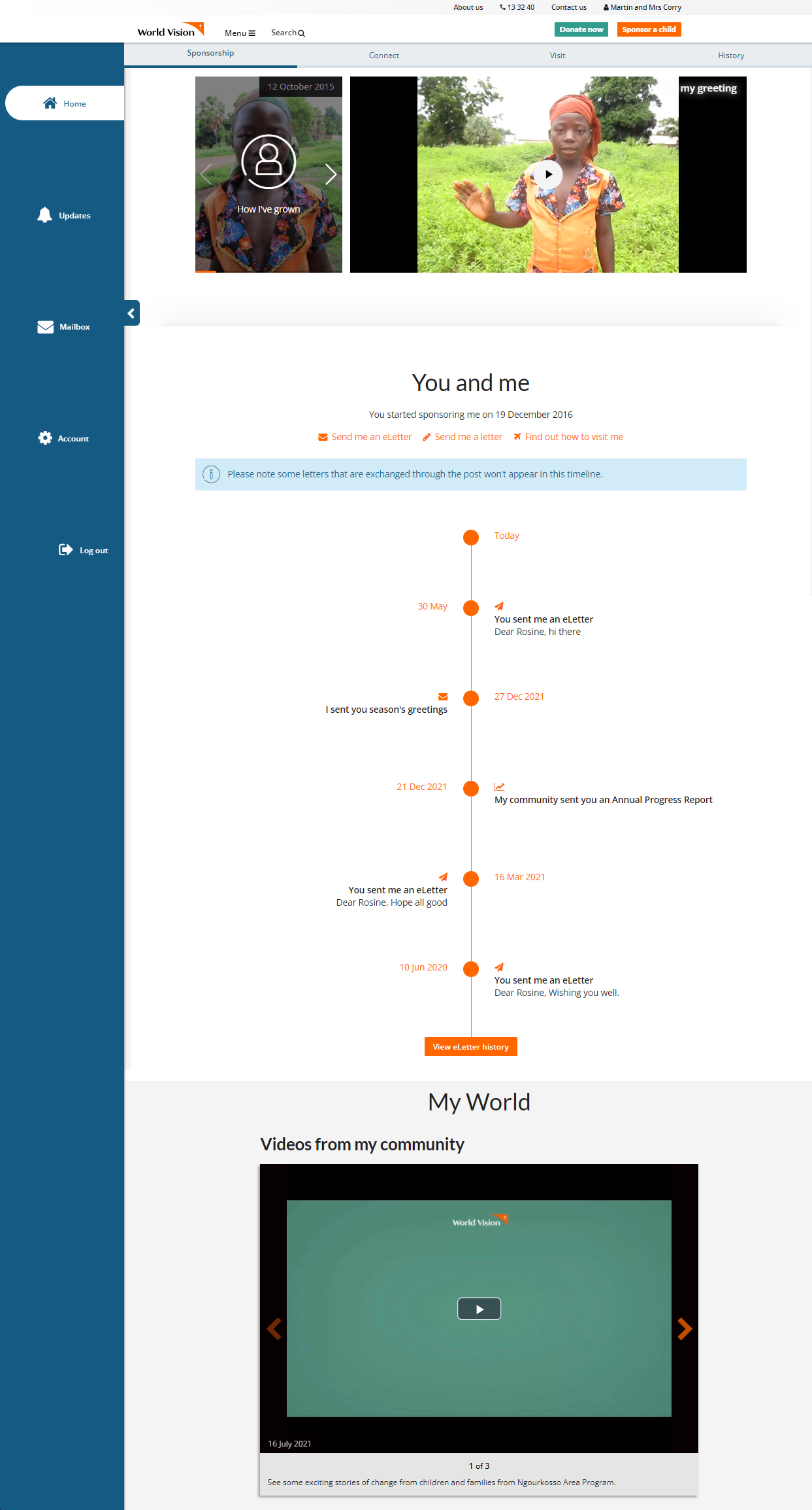
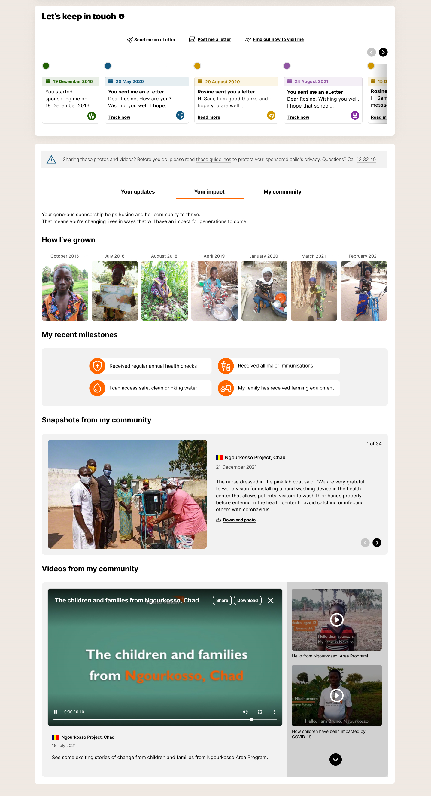
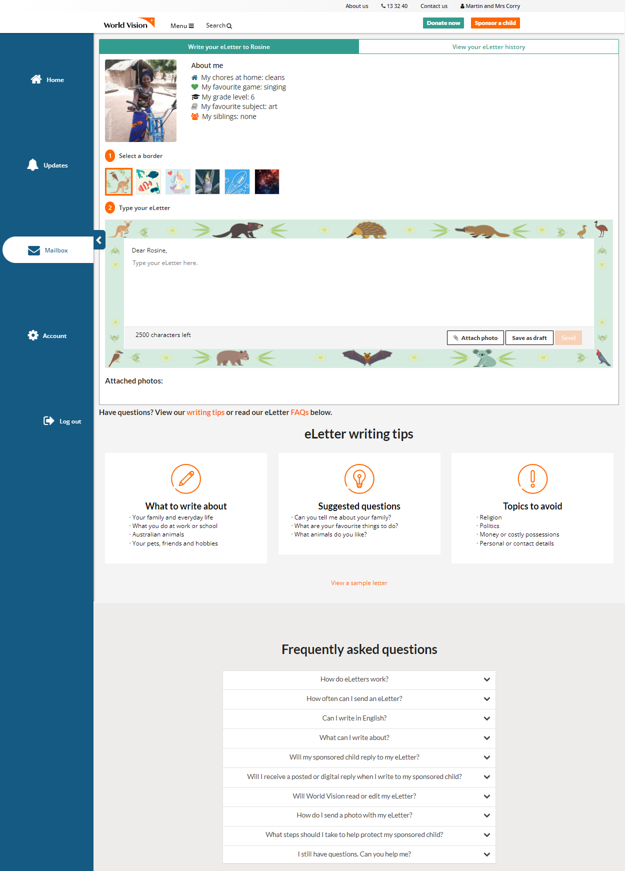
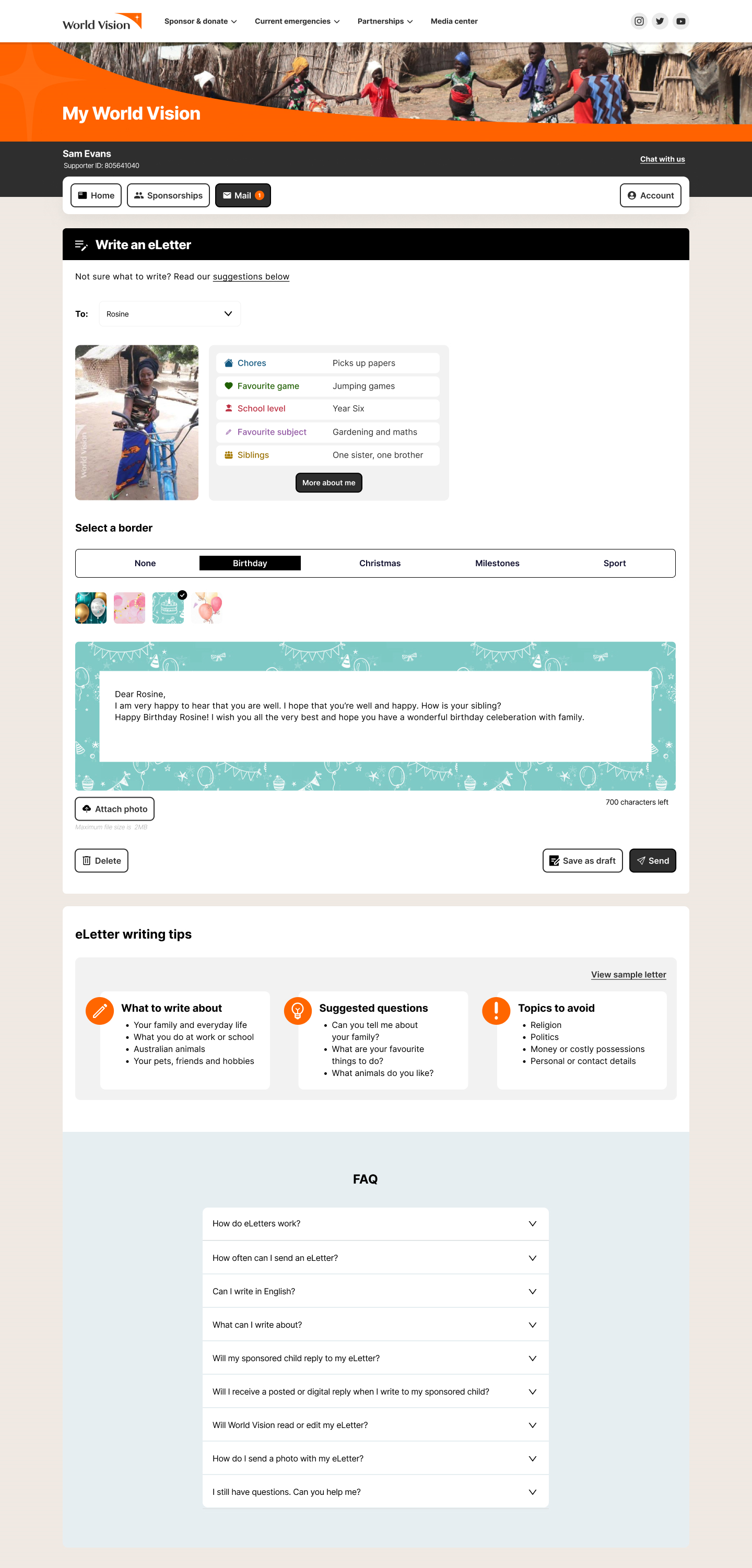
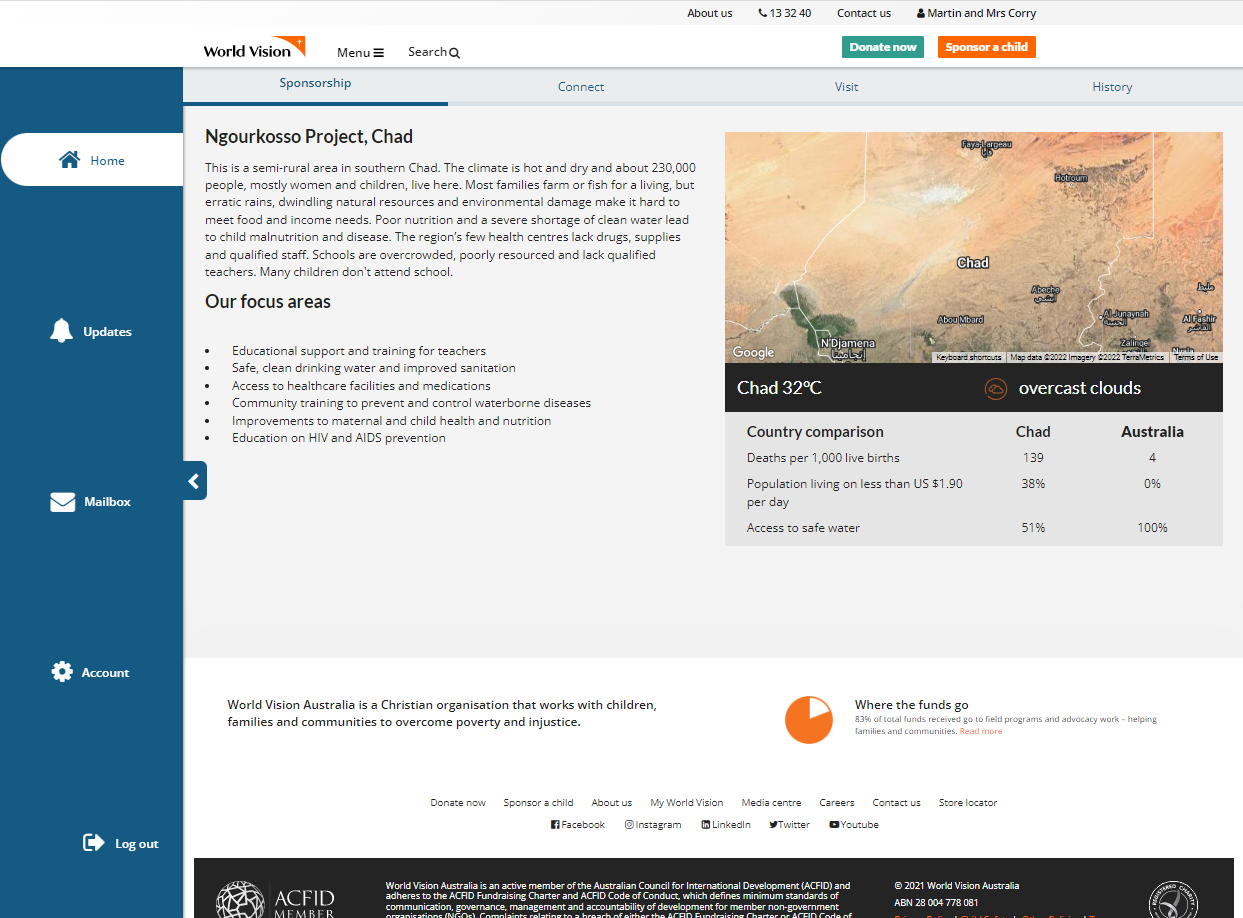
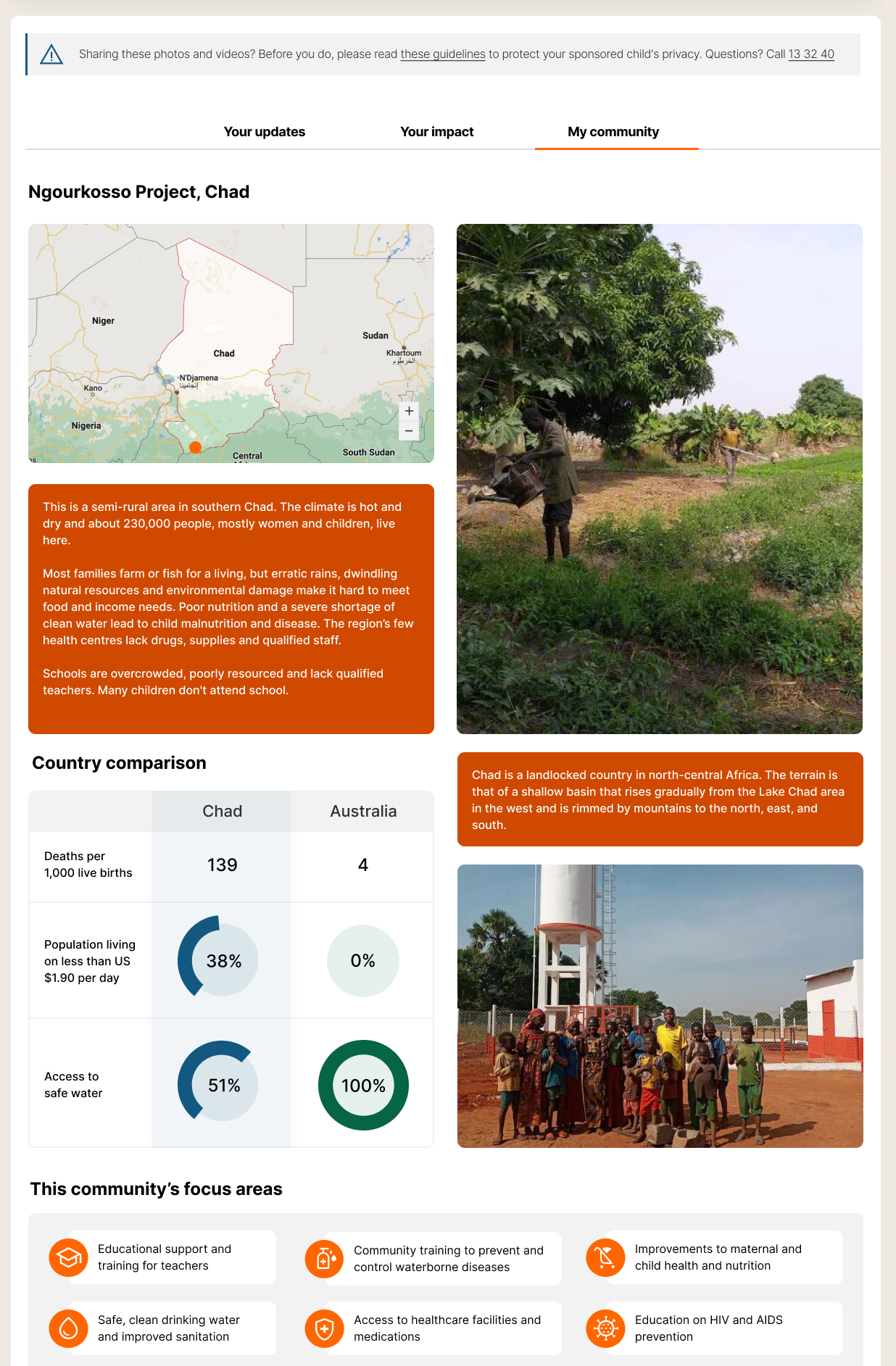
World Vision has a goal of providing a superior sponsor experience and increasing sponsor retention. Our research shows supporters want to see before and after content to show the impact their donation has made. We will deliver more frequent and personalised content via the World Vision customer portal and mobile app. This will help supporters to become more connected to the child they sponsor.
Problem
After performing several rounds of usability testing to understand users’ sentiment toward the WV portal, results indicated that:
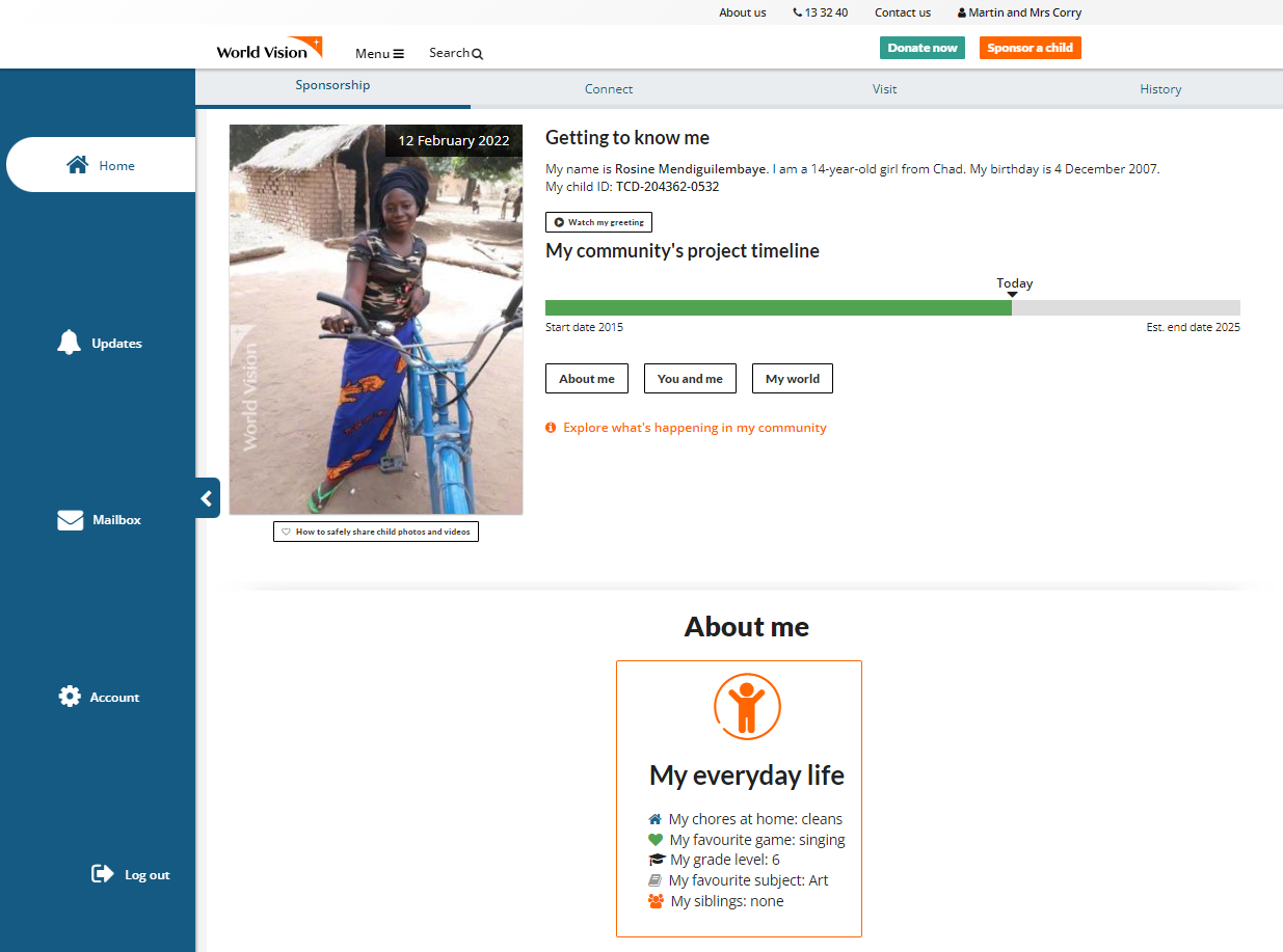
![]() The World Vision portal was perceived as convoluted and too copy-heavy.
The World Vision portal was perceived as convoluted and too copy-heavy.
![]() Sponsors wanted to see more regular digital content that clearly showed the impact their donation was making on the ground in communities.
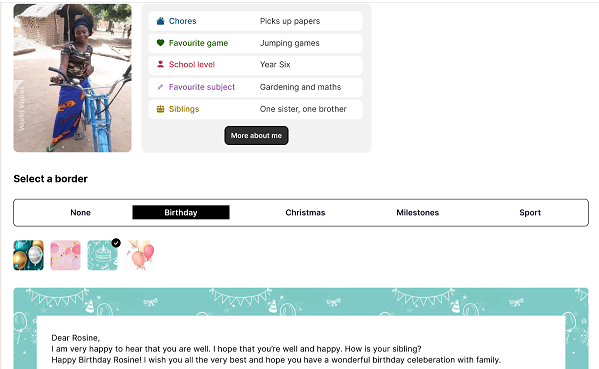
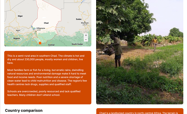
Sponsors wanted to see more regular digital content that clearly showed the impact their donation was making on the ground in communities.
![]() Outdated content with inconsistent designs and outdated ways of talking about the brand was still in existence on the portal, offering a confusing experience to our Australian audience.
Outdated content with inconsistent designs and outdated ways of talking about the brand was still in existence on the portal, offering a confusing experience to our Australian audience.
To solve the above problems, we recognised that the Information Architecture needed transformation, so we implementated a portal governance strategy and new design system.
My Involvement
User Research
Wireframing & Prototyping
User Testing
My Design Solution Approach
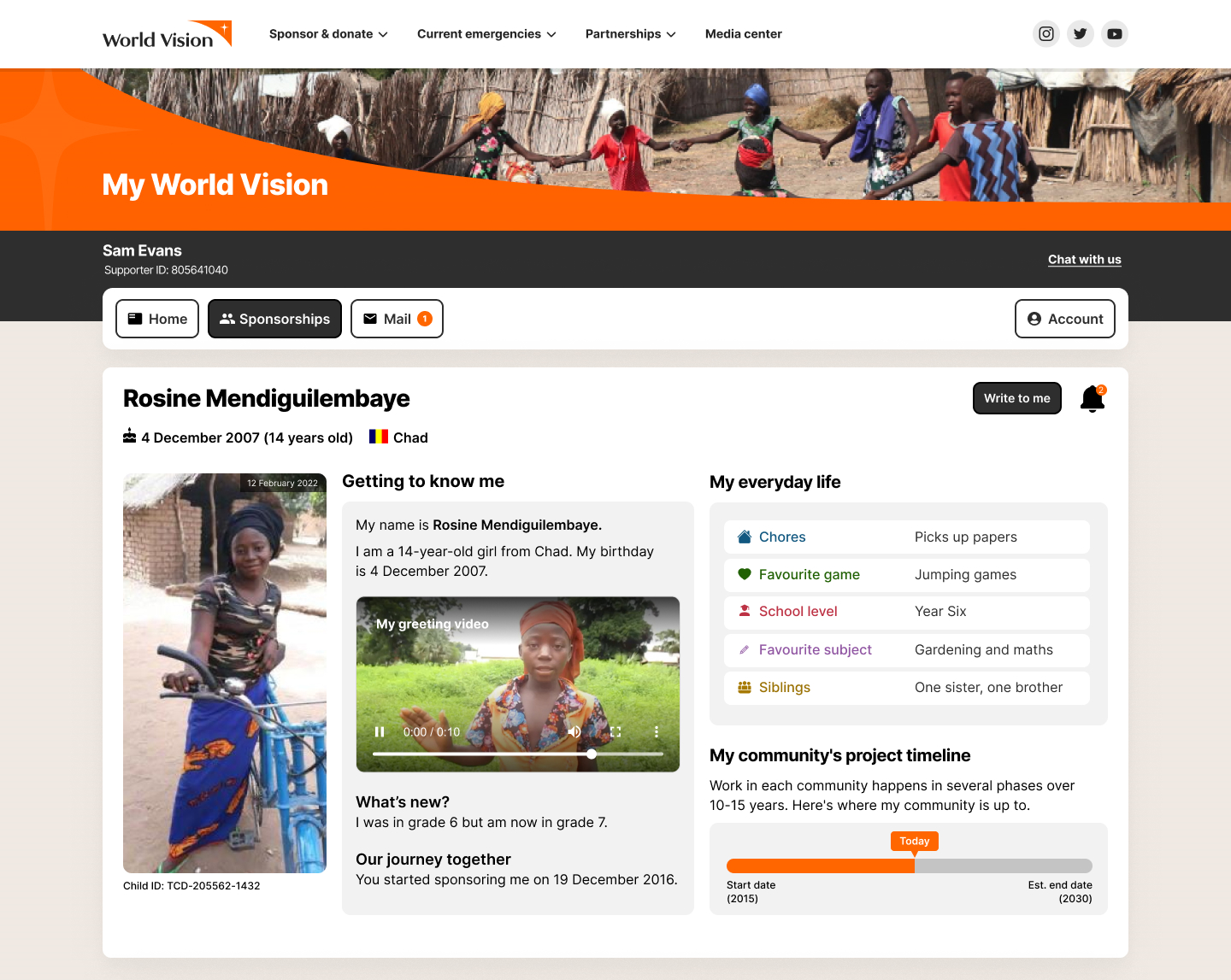
We used a parallel and iterative design process. I regularly reviewed the solution appropriateness after each design change, then performed user testing and analysis to ensure that the proposed solutions were practical. Sponsors reported the proposed design was more consistent, simple and engaging to use.
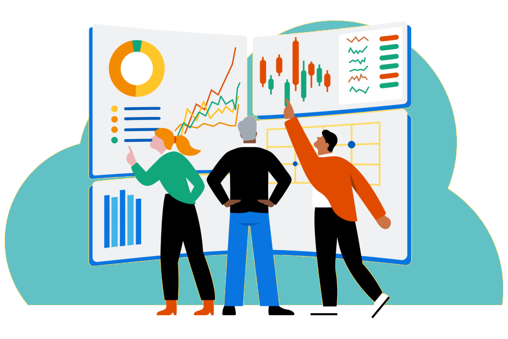
I am currently working closely with the developers to finalise the design of a comprehensive design system that is based on Material Design. This will reduce design and technical debt, and improve workflow productivity, efficiency, aesthetic consistency and accessibility.
I am also leading the design of World Vision Australia new portal.
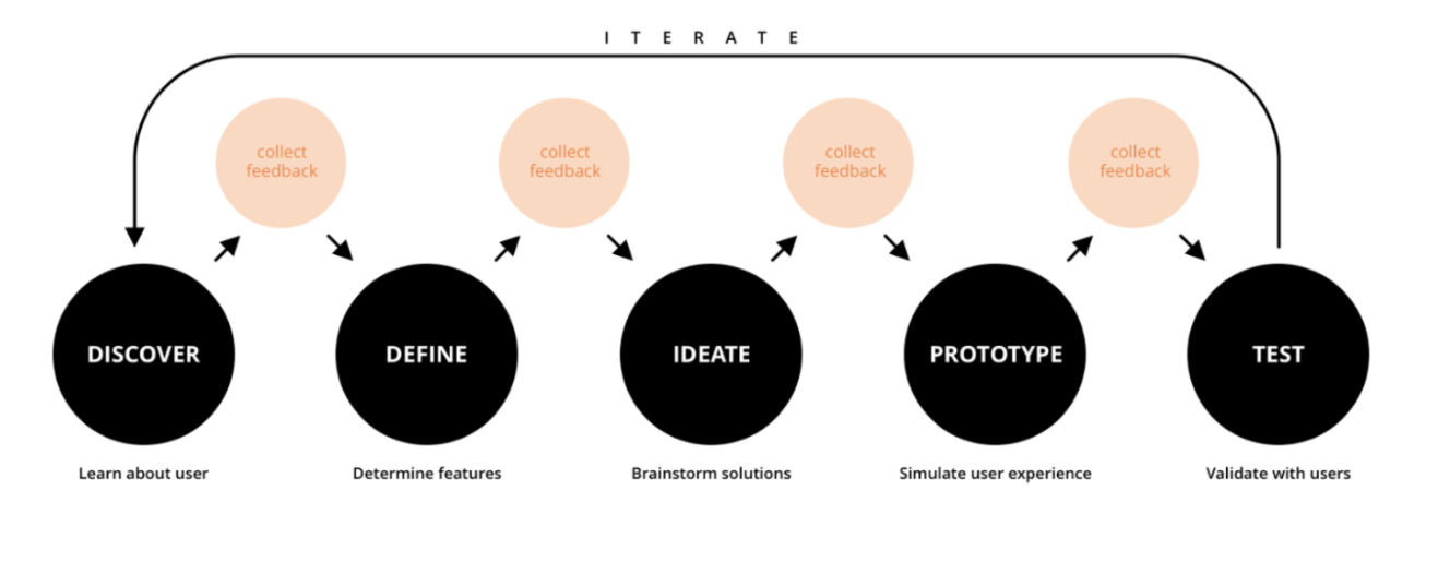
User Research Process
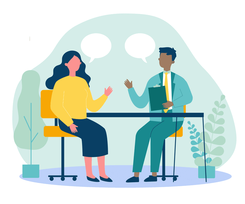
During the first step of this project, I carefully studied the research findings of previous UX designers regarding stakeholder expectations of the portal and current pain points. I then narrowed-in to interview key stakeholders to get more in-depth and up-to-date information on their needs and expectations.
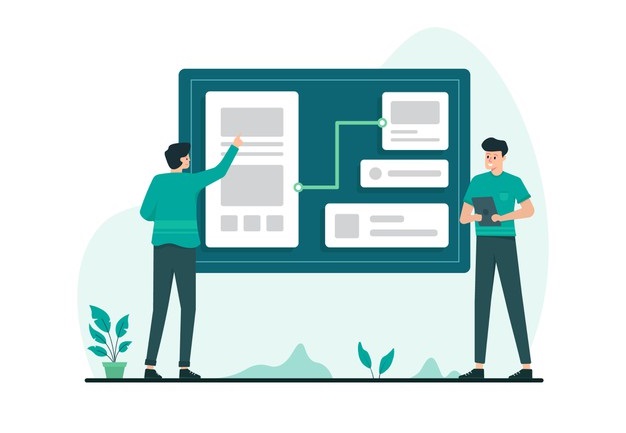
I then mapped out the current information architecture of the existing portal and presented how the organisation can simplify the structure.
During this phase, I tested our online product’s accessibility against the Web Content Accessibility Guidelines (WCAG). I performed a gap-analysis against the guidelines. I then presented a business case to the marketing and digital teams that it was most efficient to incorporate this as a late addition to the requirements, rather than rework later on. As a result of my justification, Word Vision added the scope of meeting at least Level AA accessibility conformance for the new portal design.
Analyse and Brainstorming Process
In this phase, I organised different sessions with the key stakeholders to understand their top priorities and prepared a detailed plan for the design sprints. I then planned different ideation workshops with the team to discuss potential solutions and overcome the pain points and problems discovered. As a result, I gathered many valuable suggestions for the next phase.
Prototyping Process
In this phase, I first created wireframes and checked them with the key stakeholders. Regular feedback with stakeholders was important to maximise the value gained during the project. Upon approval from the stakeholders, I then created high-fidelity interactive prototypes (Figma). I also reviewed prototypes with the developers regularly.
User Testing Process
I created various test plans and scripts for the new portal redesign to uncover design problems. I also facilitated remote moderated and unmoderated user testing sessions for both desktop and mobile users.
To find meaning in the tests, it is important to analyse the data. I use affinity diagramming (Miro board and Excel) to process the data. From here we draw out the wins, pain points, problems and opportunities. I am always looking for cognitive biases when looking at the data. You start to see certain biases pop up if there is too much information or not enough meaning in the content.
Result
The new portal has not yet been fully implemented. However, we have seen a lot of positive changes in users’ behaviour while performing different tests on the interactive prototypes. We also received lots of positive feedback on the design.
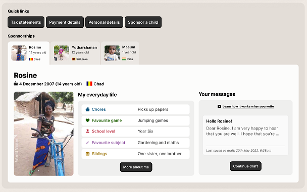
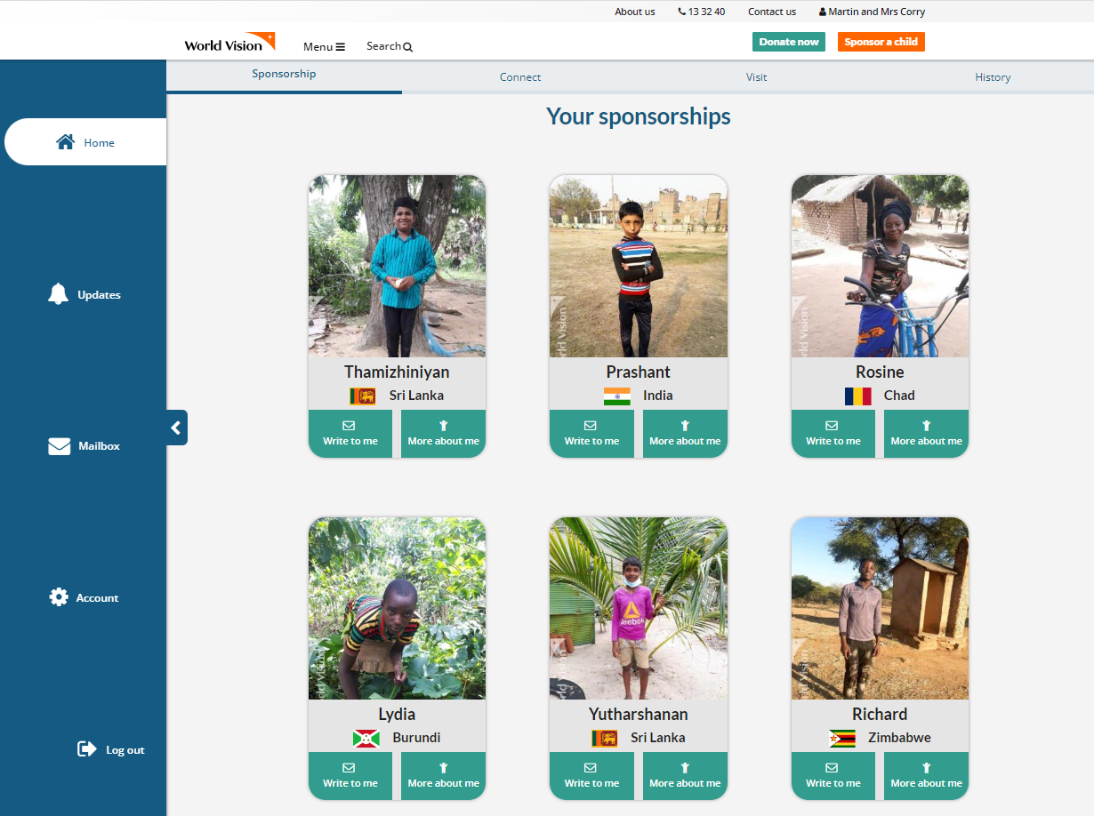
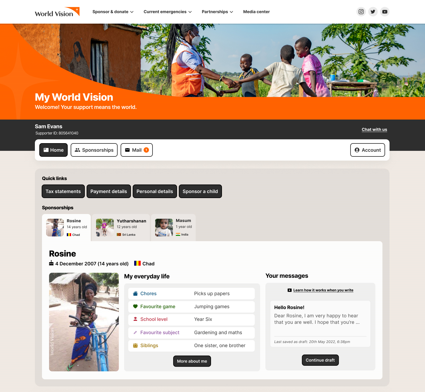
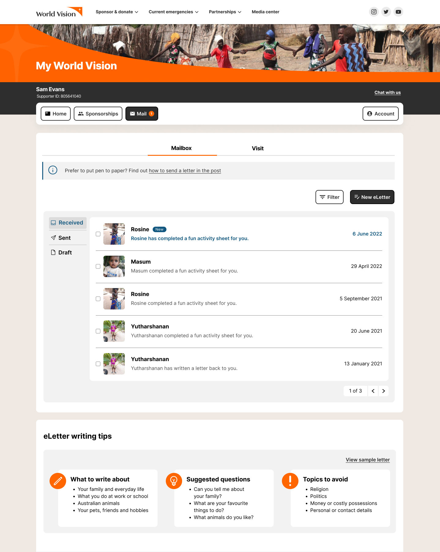
- Users found the "Quick links" helped them to more quickly navigate various actions.
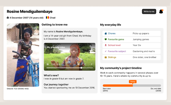
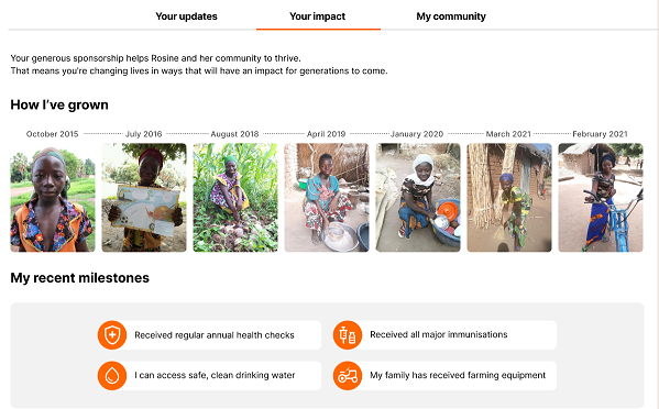
- Users felt more trust by seeing regular and up-to-date content and appreciated the transparency about their donation impacts.
- Users reported the re-design was more modern, consistent, simple, user-friendly and straightforward.
- Users found that thoughtful content and beautiful visuals grabbed their attention more than text.
- Users felt more connected with the child they sponsor due to the structure and display of child information and updates.